$1 Donations make us growth

Friday, April 20, 2012

new iPad is officially launch in Malaysia


WAIT NO MORE!!! The new iPad is officially launch in Malaysia and Following Country : Brunei, Croatia, Cyprus, Dominican Republic, El Salvador, Guatemala, Panama, St Maarten, Uruguay and Venezuela.


Wifi Version
RM1499 – 16GB
RM1799 – 32GB
RM2099 – 64GB


4G + Wifi Version
RM1899 – 16GB
RM2199 – 32GB
RM2499 – 64GB


BOX CONTENT:
1x The New iPad (iPad 3) (with microSIM)
1x Dock Connector to USB Cable
1x 10W USB Power Adapter
1x Documentation


Will you get ones?


Tuesday, April 17, 2012

The case for a four-inch iPhone with 16:9 display


There’s no shortage of iPhone mockups these days, a tell-tale indication of the launch date drawing near (we’re looking towards a Fall launch). We already told you about one possible iPhone mockup and shared an interesting theory regarding the argument for a four-inch iPhone.
The problem is, the vast majority of artists’ renditions depict an iPhone with a blown up display that, however, features the same 4:3 aspect ratio as all prior models.
So, how about a four-incher with a 16:9 aspect ratio display?
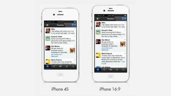
The above mockup, credited to Dan Provost (via MacStories), depicts a 16:9 iPhone with a four-inch display.

The image above shows the current iPhone, a mockup of the alleged 16:9 phone, and a mockup with a bigger 3:2 screen at 300dpi, which measures 3.84” diagonally. I estimated that the physical size of the phone would need to increase slightly, getting taller in the 16:9 version and wider in the 3:2 version. I don’t think either of these size increases are deal breakers. The 3:2 version is actually still narrower than the iPhone 3GS.

The big issue with changing the aspect ratio: apps.
Because Apple definitely would not reduce the iPhone 4/4S’s 326 pixel-per-inch count on a larger canvas, elongating the 4:3 inch to a 16:9 aspect ratio would increase the number of pixels, meaning all existing apps would not scale up properly to fill up the entire screen.
The easiest and the least user-friendly solution would entail letterboxing the app’s user interface.
Provost has an interesting take on the dilemma: 
I think Apple should keep the 3:2 aspect ratio and increase the physical size until it reaches the 300dpi retina boiling point, maintaining the 960×640 pixel count.

Doing this would let Apple brand a four-inch iPhone with a 16:9 display under the Retina moniker whilst keeping the existing 960-by-640 pixel resolution for app compatibility.
Bumping up the screen to a 16:9 aspect ratio and retaining a 326 pixels-per-inch density would increase total number of pixels available. Apple could use those extra pixels for additional user interface elements.
Think widgets, a souped up multitasking bar, bigger Dock icons and even – why not – touch controls like the navigation buttons found on the Samsung Galaxy Nexus.
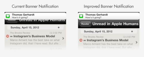
Another good example are banner notifications which normally appear subtly at the top of the display, overlaid on top of the running app. The additional pixels would let Apple render banner notifications unobtrusively, right above the running app.
Those are all valid points and if Apple chooses to take the 16:9 route, they’re definitely not going to make everyone’s life harder by requiring that developers update their apps just to cater for an extra few hundred pixels.
Apple is all about simplicity. I’m convinced they’d rather keep apps running at the 960-by-480 pixel resolution and use the extra pixels to tweak the iPhone’s user interface and provide some unique software features not found on 3:2 iPhones – just like Siri has remained an iPhone 4S exclusive, even though it’s just software that we know runs well on non-A5 devices.
There seems to be a consensus out there that Apple should increase the screen size of a next-generation iPhone to a four-inch(ish) canvas.
I’m not a proponent of blowing up the iPhone’s display just because the Android camp has been doing it in the absence of any meaningful and major differentiator.
But I sure would prefer my iPhone with a 16:9 aspect ratio display.
How about you? 


[Via: idownloadblog]

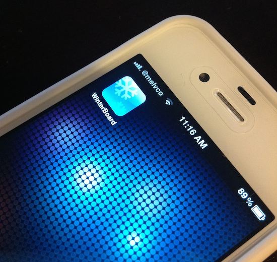
WinterBoard receives major update


WinterBoard. It seems like just mentioning the name of the utility can send shivers down the spine of jailbreakers everywhere. In fact, a lot of folks won’t install a particular app or tweak of it requires installing the unpopular themer.
So what’s wrong with it? Speed, stability, you name it. WinterBoard has long been a scapegoat for jailbreak-related problems. But the utility may be worth a second look now, as it has just received a major update…
Saurik pushed out WinterBoard 0.9.3904 today and it features a host of bug fixes including


  • 5.x: Solve SpringBoard Scroll Lag (only with “SummerBoard Mode” off)
  • Default SummerBoard Mode to Off
  • 4+5: TimeStyle, PerPage, IconAlpha
  • 4+5: WinterBoard.app Respring Fix
  • 5.x: Last Ditch kill -KILL Respring
  • 4+5: HTML Wallpaper Multi-Touch
  • 2+3: Fixed SpringBoard Crashes
  • Corrected Order of UISound Stack
  • Use Fallback/* to Wildcard Theme


As a minimalist, I don’t typically use WinterBoard. But the utility has been working great for me since I installed it and a handful of compatible tweaks and themes on my iPhone 4S this morning. And the word is it runs a lot better on A4 devices as well.
At any rate, if you want to revisit WinterBoard, you can find it in Cydia, in the default repo, for free.
Have you tried the new WinterBoard update? What do you think? 


[Via: idownloadblog]

Awesome Calendar: when you can do it all, anything’s possible


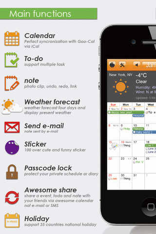
Yunasoft’s new productivity/utility entry in the iTunes App Store, Awesome Calendar, boasts big about its capabilities. As well it should. After all, one of the first things smartphones were supposed to do, and do well, was help us balance busy schedules.  Time management apps have to go the extra mile to impress us, and the all-in-one tool Awesome Calendar looks like it might just outpace the competition.
Feature set meets interface is the name of the game when multifunctional is the main requirement, and Awesome Calendar does a beautiful job of marrying the two. Its calendar, notepad, and to-do list modules work in concert to bring users lives into productive harmony.  Each of these aspects feature some extra functionality to make them shine, with Awesome Calendar’s superior design balancing form and function along the way…
While the individual functions that the iPhone is capable of carrying out to help us balance busy schedules are impressive, UI can make or break the user experience, no matter how many of those fantastic features are combined in one app. Awesome Calendar’s user interface does a great job paving the way for users to actually utilize each and every one of its functions quickly and conveniently. Not to mention, it looks good while it gets the job done.
Awesome Calendar is sleek and spare, without once giving the impression of being minimalistic, because its UI aims for unobtrusive. Intuitive swipes and taps make navigation a breeze, while additional gestures can fine tune the user’s efficiency. And, be still my heart, this app actually includes a user manual. No doubt many functionally impressive apps get dismissed because they don’t. It’s simple common sense, but something that seems to get left out more often than not.

Awesome Calendar is multi functional in the best sense of the word: not only does it have a menu of fantastic features, but accessing and using them is easy, fun, and convenient. The devs behind this app have focused on the fact that for an all-in-one tool to actually work, users need to feel comfortable using all of it. And what kind of goodies have they packed into this appealing interface? Well, all kinds.
The notepad, for example, includes integrating photos with the notes. Now, if you’re thinking you don’t have much use for that, hang on. The truly awesome part about that is that if you find it necessary for some reason to write down a physical note on paper, adding it to your main time management later without typing it out again is simple.
The to-do list links to the calendar, and displays its percentage completed on the due date. Working on a month long project? Making sure you’re on track by glancing at your calendar is easy.
The calendar function is the jewel in Awesome Calendar’s crown. Calendar sync with Google calendar, a holiday calendar layover that allows you to choose from 35 different countries for your special days, and multi calendar management that makes integrating your online calendar, school calendar, work schedule — whatever — brings everything together gorgeously.
And speaking of gorgeous, Awesome Calendar’s looks are as impressive as its performance. Clean, crisp design that speaks to professionalism while giving users some functional fun in the form of adorable virtual stickers makes even the most hectic schedule a pleasure to keep up with. Awesome Calendar can’t do much about your boss’s slave driver personality but it can help you keep your cool under pressure though.
The good:
  • Beautiful UI
  • Many features packed into 1 app
  • Multi Calendars
The bad:
  • Minimal Instructions
  • Syncing with Google Calendar was hard to figure out
It’s in the App Store for only $2.99 or you can try out the lite version to see if that’s the right app for you.


Saturday, April 7, 2012

Photos from inside Apple’s headquarters


Apple’s dedication to secrecy is the stuff of legends. We’ve heard a number of stories regarding the elaborate measures the company takes to ensure that unannounced products and other projects never make it outside its walls.
So as you can imagine, photographs inside Apple’s headquarters are fairly rare. But the folks over at Apple Gazette have put together an extensive gallery of pictures taken inside the building, so we thought we’d share a few of them…
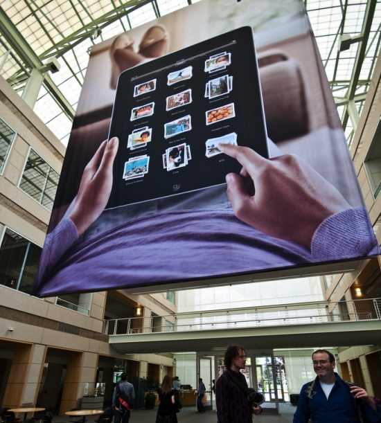
Once you enter Apple’s headquarters, you pass by a large reception desk — where most folks are asked to put away their cameras. But just beyond that, is the building’s atrium. Outfitted with tables, couches, and apparently iPad signage, this is one of the most popular places to hang out at Apple.
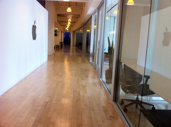
Venturing down any one of Apple’s many corridors might look like this: glass walls and wooden floors. But don’t get too excited, chances are if you’re allowed in the area, there’s nothing awesome going on. It’s well known that Apple’s R&D and design labs are accessible by only a handful of people.
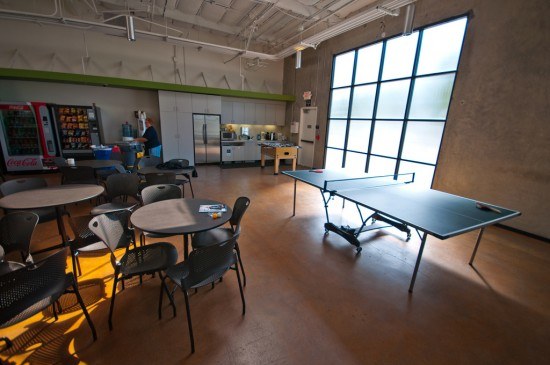
This, obviously, is one of the recreation rooms on Apple’s Cupertino campus. When they’re not working on the next iPad or iteration of iOS, Apple employees can come here to play ping pong, foosball, or just relax.
If you found these photos interesting (or not interesting enough) be sure to visit Apple Gazzette’s full gallery.
What do you think of Apple’s headquarters? Would you want to work there?


AppMosaic: an upcoming App Store discovery tool from Cydia


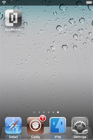
AppMosaic is an upcoming jailbreak app that brings App Store App discovery to your iDevice by means of Cydia.
I believe this is probably the first app of its kind on Cydia, and for that, AppMosaic gets major props for originality.
Upon opening the app, you’re presented with a two sided column that composes a full mosaic of app icons. The left side of the column is dedicated to the top 200 paid apps, and the right side is for the top 200 free apps.
Check out our full video walkthrough to see how AppMosaic can help you discover hidden gems on the App Store…


Tapping on one of the app icons featured on the mosaic will provide you with a few brief details about the app via a panel at the bottom of the screen. Tapping this panel will whisk you away to the App in question via the App Store app.
As it stands, AppMosaic is an interesting (if not ironic) jailbreak app that provides discovery for App Store apps that you may have overlooked. AppMosaic will be a free download, and should be available via Cydia in the near future.


Wednesday, April 4, 2012

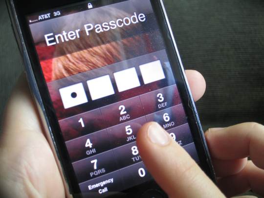
Chronic: Two-minute iPhone crack valid only if passcode is 0000


Remember that two-minute passcode lock exploit we told you about last week? The one by Swedish security firm Micro Systemation behind the XRY app that can get to your data, including contacts, messages and call logs? Well, prominent hacker Chronic has proved them wrong. In an effort to set the record straight, the hacker posted a clarification on his website that pretty much debunks their claim.
Though the XYR tool taps a popular jailbreak exploit, Chronic is adamant the two minutes it takes to crack your passcode is only valid if you set your passcode to ’000′. Conspicuously, that’s the passcode the firm showed in their demo clip. Interesting enough, the original video of the exploit in action is no longer available on YouTube.
The two-minute passcode crack is a “linkbait”, explains the prominent hacker who goes by his real name Will Strafach. According to his blog post from yesterday, the Micro Systemation exploit only holds true if your passcode is set to ’0000′, adding:

The only “special” thing XRY has done is create a tool that is simple enough to be utilized by LE personnel.


Furthermore, it won’t work on the iPhone 4S, iPad 2 and the new iPad.


The simpliest way to “thwart” the use of this software on your phone would be to get the latest model, because (as people who are farmilliar with jailbreaking know) the limera1n exploit is fixed in the bootrom of the A5 (iPad 2 and iPhone 4S) as well as the A5X (iPad 3) chip.

He’s also saying people unwilling to upgrade their device to the latest model can protect themselves from passcode-cracking tools such as Micro Systemation’s XYR app by setting a lengthier password.
Just open open Settings on your device, tap General, then Passcode Lock and disable the Simple Passcode toggle. This will help better secure your device as it takes “much longer than two minutes” to crack a lengthy passcode.
I must admit, I have my device protected with a simple four-digit passcode. I’m just not fond of long passwords as these take much longer to type in each time I unlock my device.
How about you? Do you use a simple passcode or a lengthier one? 


[Via: idownloadblog]

Rumor: Foxconn said newiPhone is coming on June


Macotakara points to a report this morning from TV Tokyo’s World Business Satellite. The TV show recently conducted an interview with a Foxconn personnel recruiter who had some interesting things to say about the next iPhone.
According to the blog, the recruiter told the news program that Foxconn is in the midst of a major hiring binge to prepare itself for production of Apple’s upcoming handset — a device, that he says, will be launching in June…
Here’s an excerpt from WBS’ report courtesy of Google Translate:

“Foxconn is known in the assembly of Apple products, and has been in the recruitment of 18,000 more personnel. Personnel recruitment office says it’s recruiting for the production of iPhone 5.”

This actually lines up with a report we heard late last month that Foxconn was looking to hire in upwards of 20,000 new employees in the near future. But we’re still fairly skeptical that we’ll see Apple unveil its next smartphone this summer.
Up to this point, the rumor mill hasn’t pinpointed a launch date for the sixth-generation iPhone. But fall seems to be the more likely candidate. This would allow Apple to be certain that early iPhone 4S adopters have had the handset for a full 12 months (most carriers will allow subscribers to upgrade their phones after a year), and would set it up for another blowout holiday quarter.
When do you think Apple will unveil its next iPhone? 


[Via: idownloadblogAppleInsider] 

Search This Blog

Popular Posts